The previous site followed a traditional style often seen throughout the industry, which added to the difficulty of diversifying Think Box in the market from competitors.
While the team at Think Box wanted to modernize their website to stay in line with the advancement of the industry, they always had their users in mind.
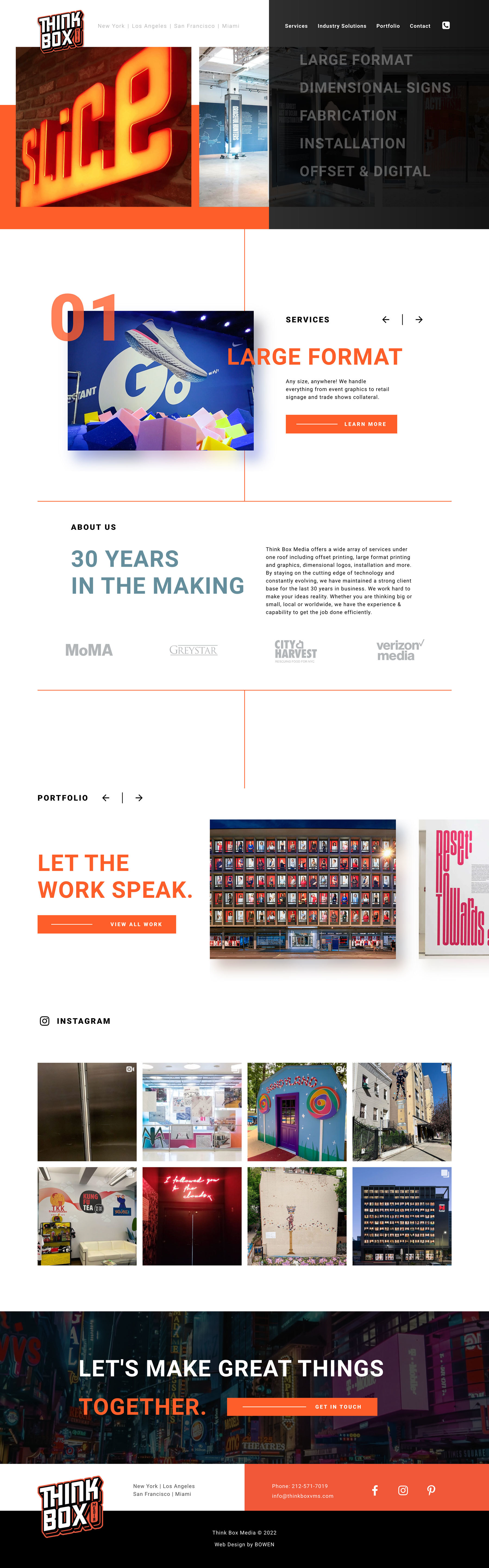
One of the primary goals for the new site experience was to establish Think Box's broad range of services at glance, without feeling cluttered or outdated. A significant portion of long-time users were not aware of key offerings -- which could both save customers time on purchasing, while also elevating the LTV of their Think Box's audience.

We fully revamped the gallery experience to a portfolio page to both enhance and simplify the way their work is showcased, separating each section by project type and arranging multiple image sliders with varied image sizes. Ultimately, this is what print partners want from Thinkbox’s services – so finding a way to demonstrate this ability on-site, on a high purchase-intent page significantly improved the site’s ability to convert.
Each service is highly visible from the homepage at first glance, with its own on-hover animation -- which changes the backing image, showing work examples specific to the selection, and encouraging visitors to click and view the full-service page. The service pages themselves were transformed into a hybrid page -- beginning with a gallery, but holding larger segments of service information behind overarching topics in a unique customer journey. When the users engage, the full text will display – allowing the same access to the breadth of information, while creating a minimal aesthetic with a degree of flash.