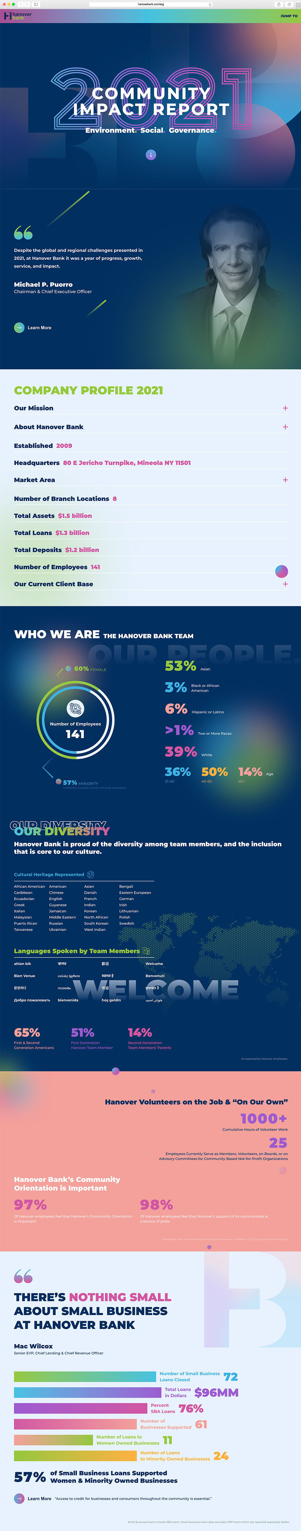
Hanover had a clear vision of how they wanted shareholders as well as the local community to react to the look and feel of their Community Impact Report, and needed a partner who met their high standards. These reports are meant to represent the broader impact a bank can have on its surrounding community, and are considered a statement of investment security. The document had to cover a lot of ground to convey their recent acquisitions and long-term solutions. Nevertheless, annual reports are most often put together as a static PDF or in a traditional layout that presents this data. Hanover wanted to create an engaging experience that not only grabbed the attention of the reader, but introduced these points for consideration with the true weight of their achievements.
Striving to break the mold of their traditional brand colors, our team was encouraged to introduce newer colors that would elicit feelings of excitement, optimism, and boldness – but in a way that would still capture the same brand spirit and represent the bank appropriately.

The report opens with an animation sharing Hanover’s focus on 3 key factors: Environmental, Social, and Governance. The “down” animation arrow urges the user further into the experience, where they encounter a letter from the CEO, allowing for a side-swipe entrance animation and color change to create warmth and generate additional interest. Our goal was to ensure the report immediately grabbed the user’s attention with these custom animations and innovative transitions and experiences within sections compared to the traditional community report.
BOWEN’s design team interpolated the color palette to separate the Community Impact Report’s design aesthetic from the main bank website, while preserving enough character to link the two experiences visually. Utilizing the dark navy of Hanover’s brand color as the background allowed the team to leverage the full potential of the report’s striking, bright colors to create a captivating user experience, as well as for call-out moments within the report.
The interactive document was built to have a “jump to” section anchored to the top right corner, so stakeholders could easily jump to their points of interest with no friction. We developed different yet cohesive animations for each section, highlighting and counting up relevant statistics to underscore their magnitude and take their presentation to new heights.