Evolve Houston
Industry
Deliverables
Web URL
Evolve Houston is a nonprofit bringing awareness and education surrounding Electric Vehicle implementation to the Greater Houston area, in collaboration with public and private organizations, local government, as well as residents. They came to BOWEN looking to create an experience that would surge productivity forward on this citywide goal.
Introduction
Pioneering Houston’s Electronic Vehicle Revolution
Electric vehicles are still a new prospect, as few are acutely aware of the opportunities being offered, and those up to speed have limited access to resources for implementation. Evolve Houston strived to create a relatable brand unlike other “go green” campaigns, uniquely tailored to the cultural pulse of Houston, TX and the surrounding area. Their hopes are that their efforts make clean air and clean transportation a reality for all Houstonians. The initiative also had to serve as a glowing example for other cities, and expand the scope of the conversation to create a positive influence across the country.

The Mission & Vision
Electrifying, Eye-Catching, and Futuristic Colors
Our four primary colors were all so bright and vibrant, so we created a warmer base color for our backgrounds to help them become more digestible and powerful, and used our neutral black in order to still stand out with bold headlines, labels, accents, and content breaks.
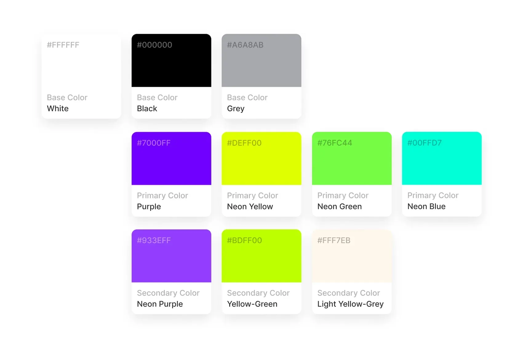
Color Palette
Localized for a Targeted Audience
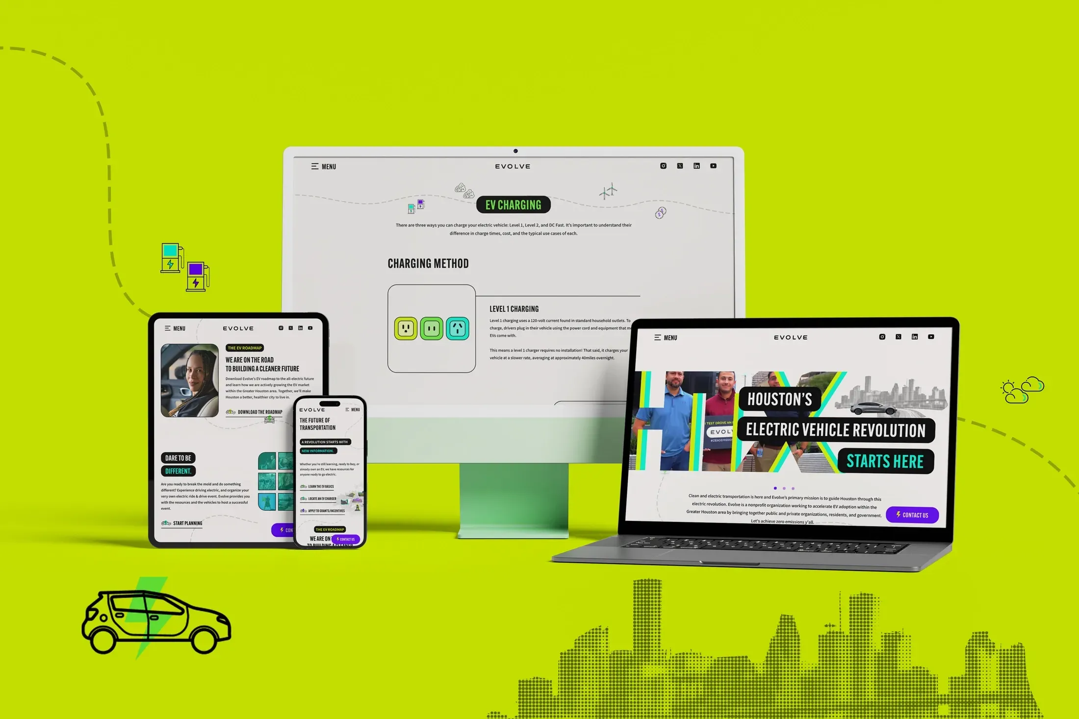
In order for our New York-based team to create a culturally relevant aesthetic for another city, we dove deep into collaborative research with Evolve to ensure each piece of content would resonate with the target audience. This was a delicate balance of studying best practices on a nationwide scale while keeping a keen eye on opportunities to inject local flavor wherever possible. Our team knew the on-page experience had to be incredibly immersive to get the level of community buy-in needed for the program to ultimately succeed.
Content Strategy
Creating an to Connect With
From the first few seconds of reaching the homepage, the organization’s enthusiasm and futuristic outlook regarding electric vehicles needed to be palpable and contagious. The design needed to inspire the visitor enough to spend time educating themselves on these benefits as well as take initiative, so the first impression needed to elicit a high degree of interest. Large, “Bigger in Texas” style text accompanies the most well-known scenic views in Houston, which the team researched and curated in collaboration with the client.

Customized Graphics for Houston
A Destination for Educational Resources, and a Path Forward
As the world of EV rapidly evolves, the website hosts a wide-range of resources and informative content for all levels of awareness: from EV 101 Basics, Benefits of Driving Electric, to providing the latest News and Reports within the EV industry, and what’s happening with Evolve Houston.

A Hub for Education & EV Research
Getting Our Audience Involved
Evolve recognizes how citizens can benefit from more guidance to a path forward for themselves and their community. They offer individuals and groups to get behind the wheel of an EV and host an “Electric Ride & Drive” event, delivering that awareness directly to their audience. Youth education programs are offered with educational presentations and EV Workshops, volunteer and internship opportunities, and the process for fleet electrification is explained on video by the team’s Director of Commercialization & Infrastructure.

A Design for Global Impact
Achieving Zero Emissions Together Ya’ll
Community members benefit from the “Find a Local Public EV Charger” feature and other programs. Calls to action pop with bold, bright colors, animated links, and buttons featuring moving electric vehicles. The user-friendly contact experience makes interacting with the organization lively. Our team crafted a digital experience that embodies Evolve’s excitement and optimism for the future. The new design is a unique, striking website that elevates the organization’s mission and inspires user action. BOWEN is honored to advance this mission, creating designs that have a lasting positive impact on the global environment and our collective future.

Content Strategy