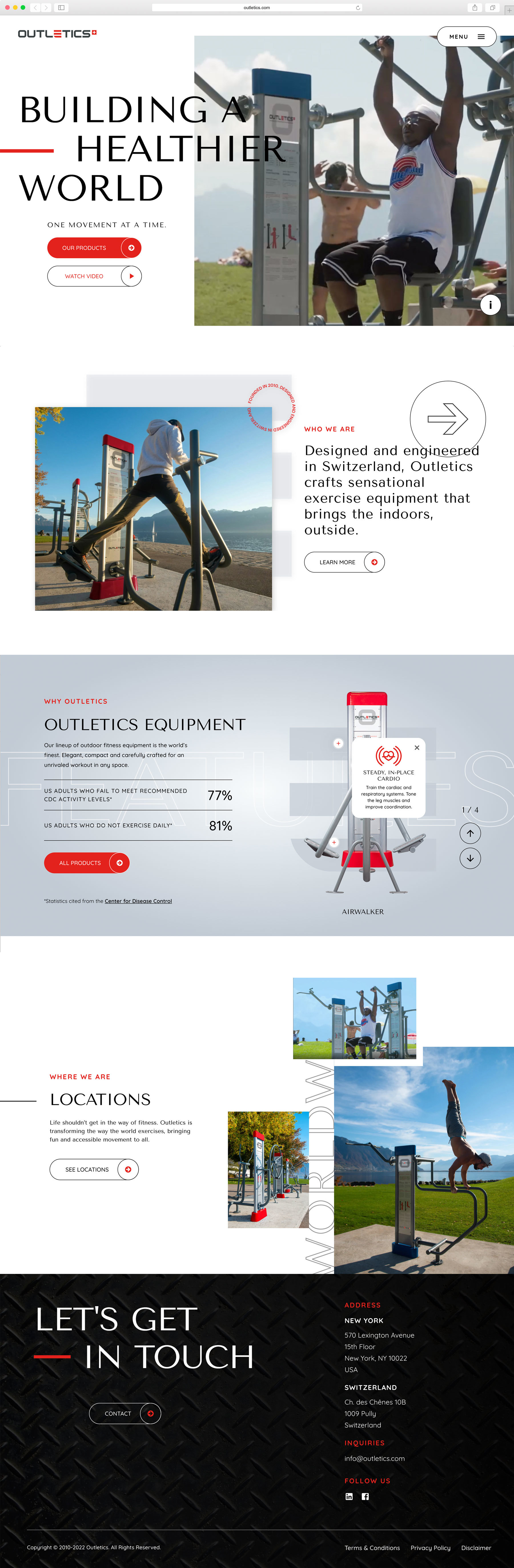
Outletics came to us while expanding their luxury Swiss athletic brand to the United States. Although they were ready to engage an American audience, the brand needed to be proudly Swiss. The look and feel of their stunning equipment needed to be translated to their online persona and print materials, while ensuring the messaging appealed to prospects in the United States. It was vital to establish them as the leader in outdoor athletic equipment, while still emphasizing the gear's fun and accessible nature.
Every point of brand contact needed to be refreshing and high-class, without alienating the casual exercise community. Since Outletics cares deeply about sharing the benefits of exercise with all skill levels, emphasizing safety was also crucial for the adjusted children's equipment line.

This balance between excellence and inclusiveness required an elevated user journey to make an impact. We developed a remarkable digital experience designed from the ground up to cross the threshold of market entry. Outletics color palette combines the high energy and strength of the distinctive red & black duo, met with the coolness of the galvanized grey. Including this fresh tone to the mix adds a layer to the brand’s vibe, leveling the scale of motion, freshness and ease of use and for maximum user engagement. We built an intuitive yet alternative user experience, scrolling from left to right, and breaking the barriers of the grid. Finally, we developed preferred descriptors to showcase the impressive product line in its best light. This allowed Outletics' signature fusion of premium standards and approachable energy to shine through an array of digital and print marketing materials.