You may have already noticed, but something seems a little different in your daily Google search. Google has once again updated their logo. Coming on the tail end of the introduction of Alphabet, Google felt the timing was right to drastically update their look. Experts agree that this is the biggest logo update Google has gone through since they decided on the original four colors all the way back in 1999.

Google’s main objective for the logo change is scalability. Google noted in a blog post, how much technology has changed since the inception of its logo, and how users interact with Google on all of these devices and apps as technology has advanced. How the logo will be viewed on mobile and wearable devices is a large driving force behind the logo re-design. The new lettering is expected to scale better to smaller sizes, making the wordmark more distinct and easier to read on all devices. The latest logo is also supposed to be easier to display on low-bandwidth connections. It weighs in at about 305 bytes compared to the existing logo measured at 14,000 bytes. This plays right into new CEO Sundar Pichai’s plan to bring Google to areas of the globe that have never accessed it before.
Introducing Google Dots: The dynamic distillation of the logo will be used for interactive, assistive and transitional moments. Were used to the fun Google animations on a desktop Google search, but are now introduced to an active animated version of the logo that will be used throughout all google operations.
Four Color G: This new G will be replacing the lower case g with the blue background that we see in some of the icons that Google uses. Having this alternative logo of a single G is another indication that size was a large determining factor when this new logo was created.
We can look to Google to see where the future of the web is going. It couldn’t be more clear that Google knows that mobile scalability is everything. Take a page from Google’s book and make sure your logo is optimized for all devices.
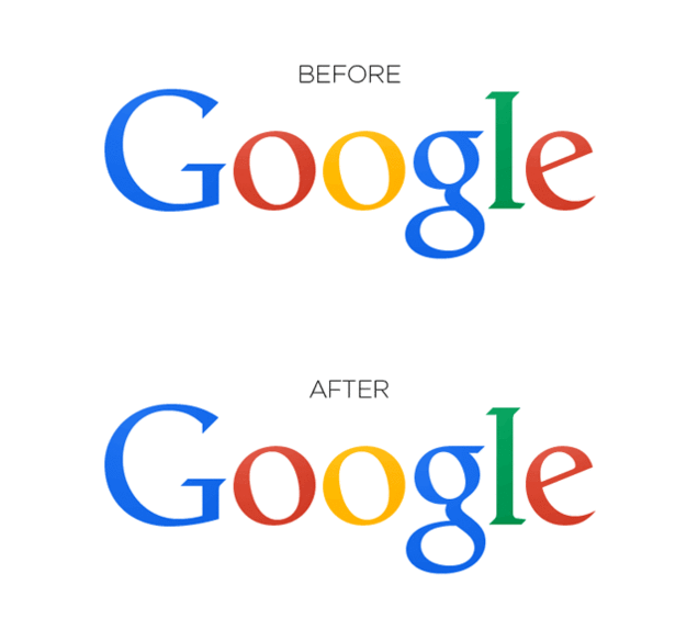
Last year, the logo made a much more subtle transformation. See if you can spot the change below:
Before:

After:

Can’t spot the difference? Well, if you look really closely, you will notice that the g and the l have been moved ever so slightly. This GIF image shows the difference a bit better:

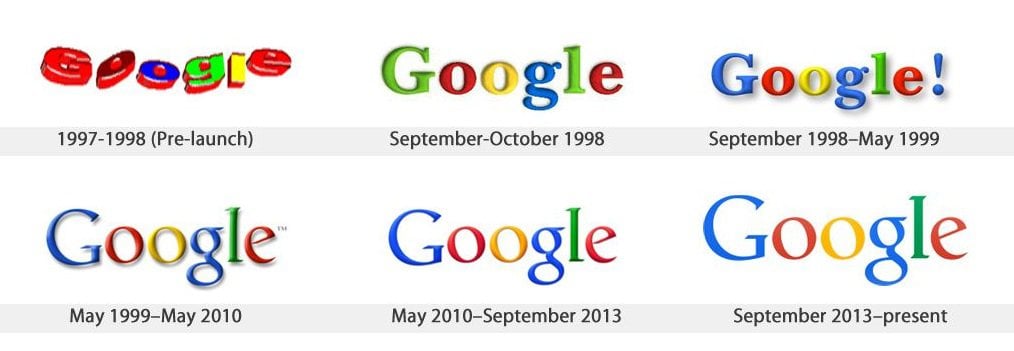
Obviously Google has one of the most recognized logos and brand image ever created, so why would they make such a small change? Believe it or not, just about every brand makes minor changes multiple times throughout the year. Google is no exception to this:

Constant upgrade and redesign of logos doesn’t just apply to huge corporations though. Its crucial that small businesses keep up with changing design styles as well. Just because a logo looked good in 1995, doesn’t mean it will still look good in 2015. While smaller businesses may have the need or the resources to change their logo every year like larger businesses, it is critical for logos to be updated and enhanced (if not totally re-designed) at least every couple years. Just remember, the logo and brand image is often the first point of contact between a potential customer and a business. If the business’s logo is outdated, it communicates to their target audience that their business as a whole is outdated as well.